LEON VAN GELDER: RUBRICS
UX / UI / PRODUCT DESIGN / REDESIGN
Leon van Gelder is a Highschool in Groningen. The work with a grading system based on rubrics. This means students review each other’s skills instead of the ordinary grading system.
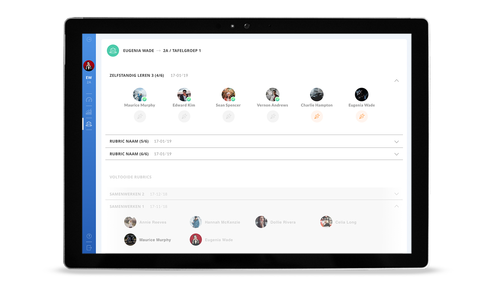
A really basic app already built but was not user-friendly and didn’t look so pretty. I worked together with another designer. We started interviewing the teachers what they need in the app and how the grading works. The app is optimized for the Microsoft Surface Go which al the people in the school use. We improved the user flow and set up a wireframe. We split the interface for the teacher, the admin and the student. After this was approved we designed a new style which fit the school building colours. We made the colours for the student a bit brighter than for the teacher to make it fit the target group.
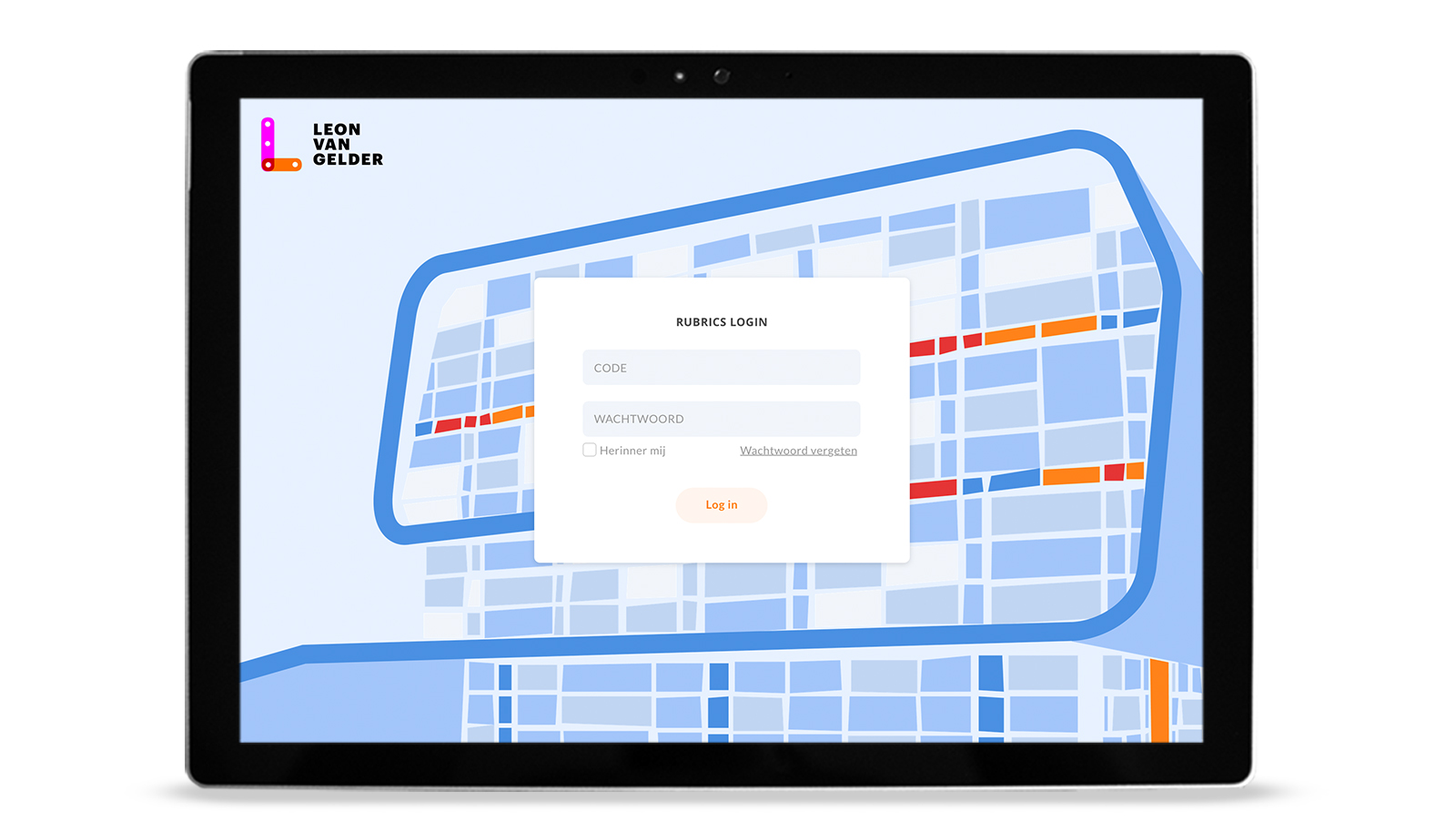
The login page became a piece of art. This is the remarkable building of the school.
WIREFRAMING
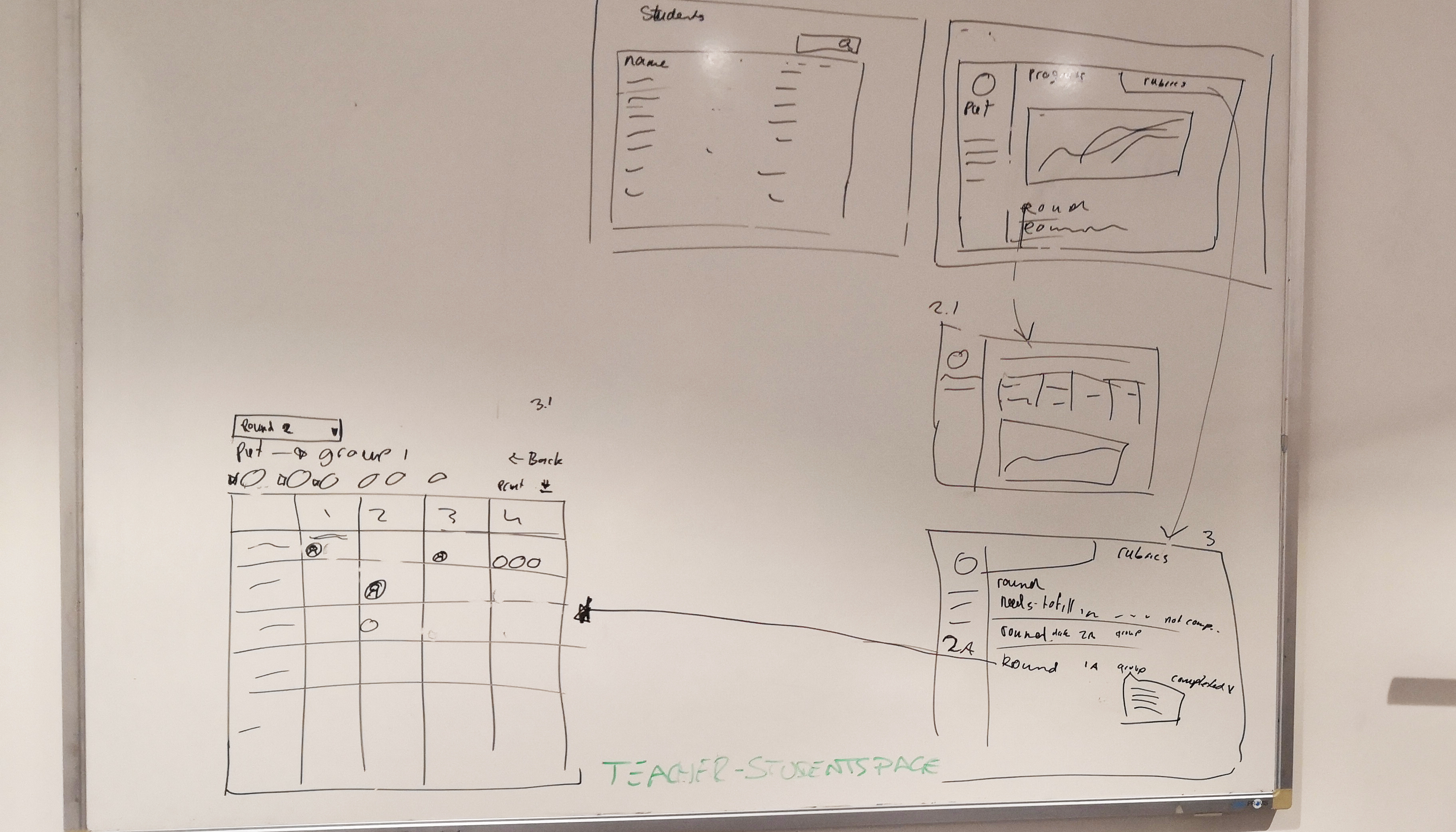
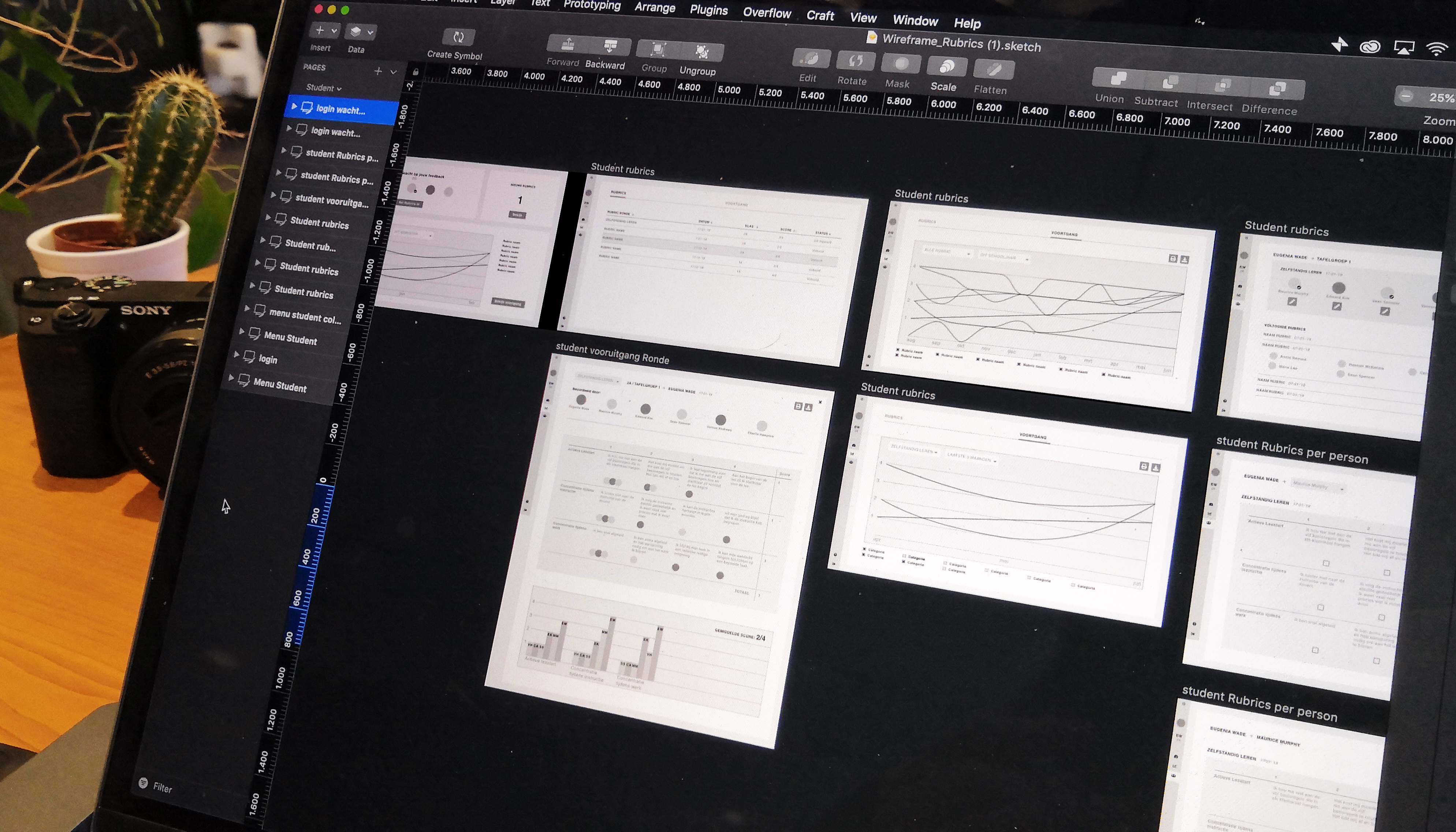
Wireframes were creatted. First we sketched out a lot on the whiteboard. After we made a more high fidelity version in Sketch app. Which we turned in to a clickable demo to test on the client before turning it in a colorfull design.
BEFORE AND AFTER
Below a few before and after views to show how it was improved. The first page was almost empty. We added a dashboard so the user can see their most important information and to-dos. Also, it helps navigate.
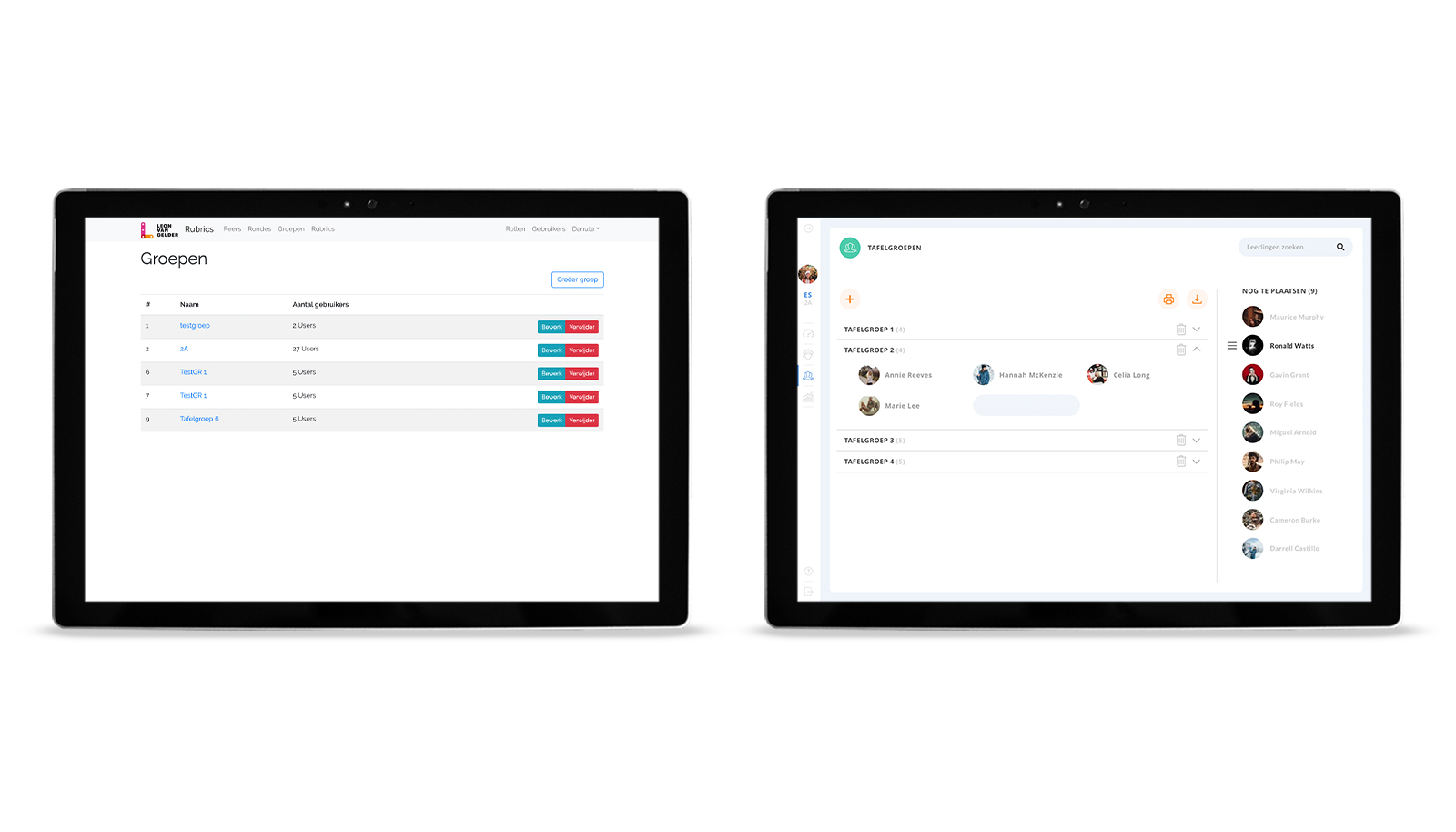
The second example shows how to create groups (in every group are 5 people who will review each other). Creating groups took a lot of steps before. In the new version drag and drop makes this really easy.
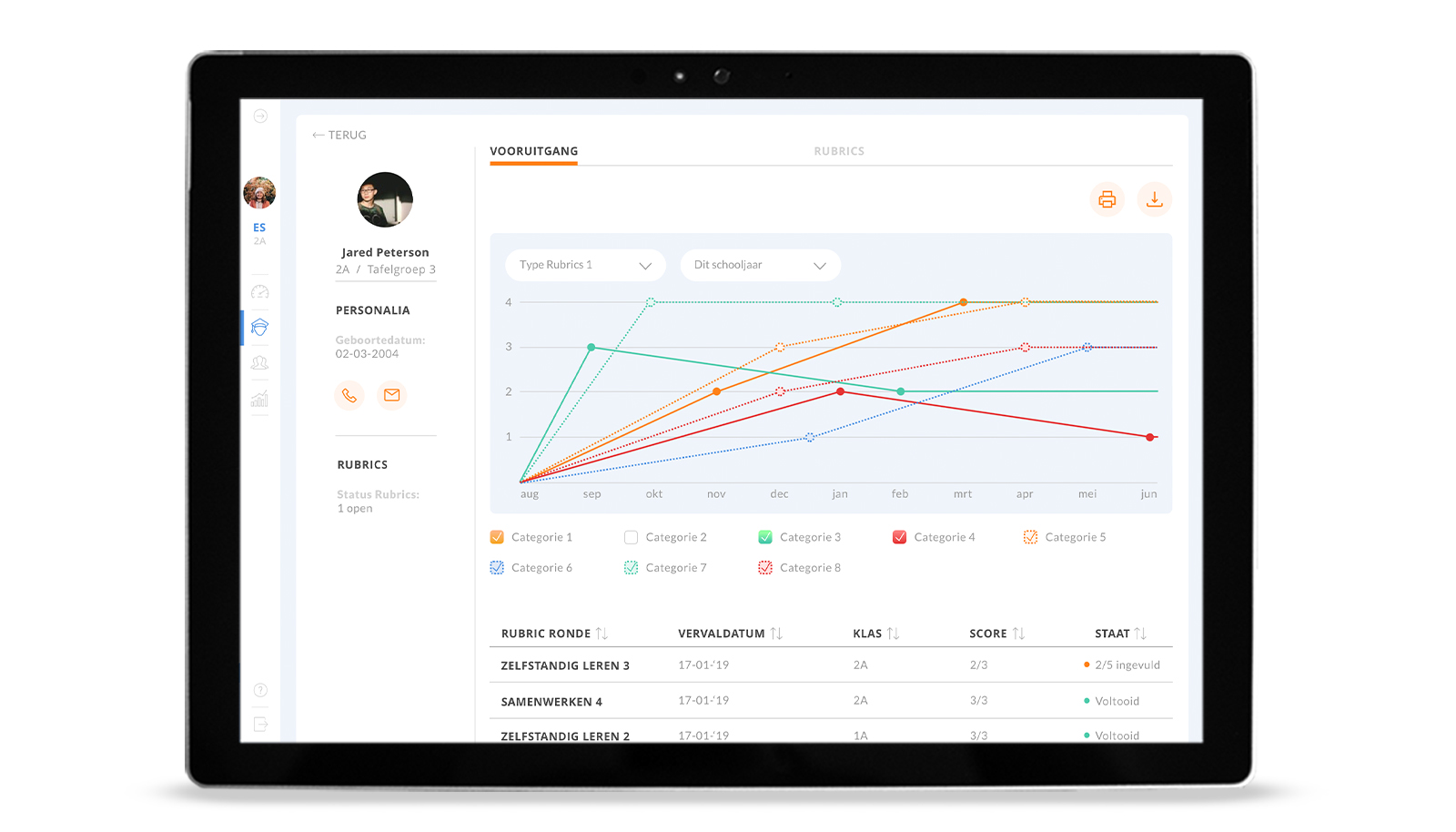
Also creating the rubrics is more simple now. The overview is improved by the use of pictures, icons, and highlighted buttons. We added graphs to create a better overview of a student’s progress.


